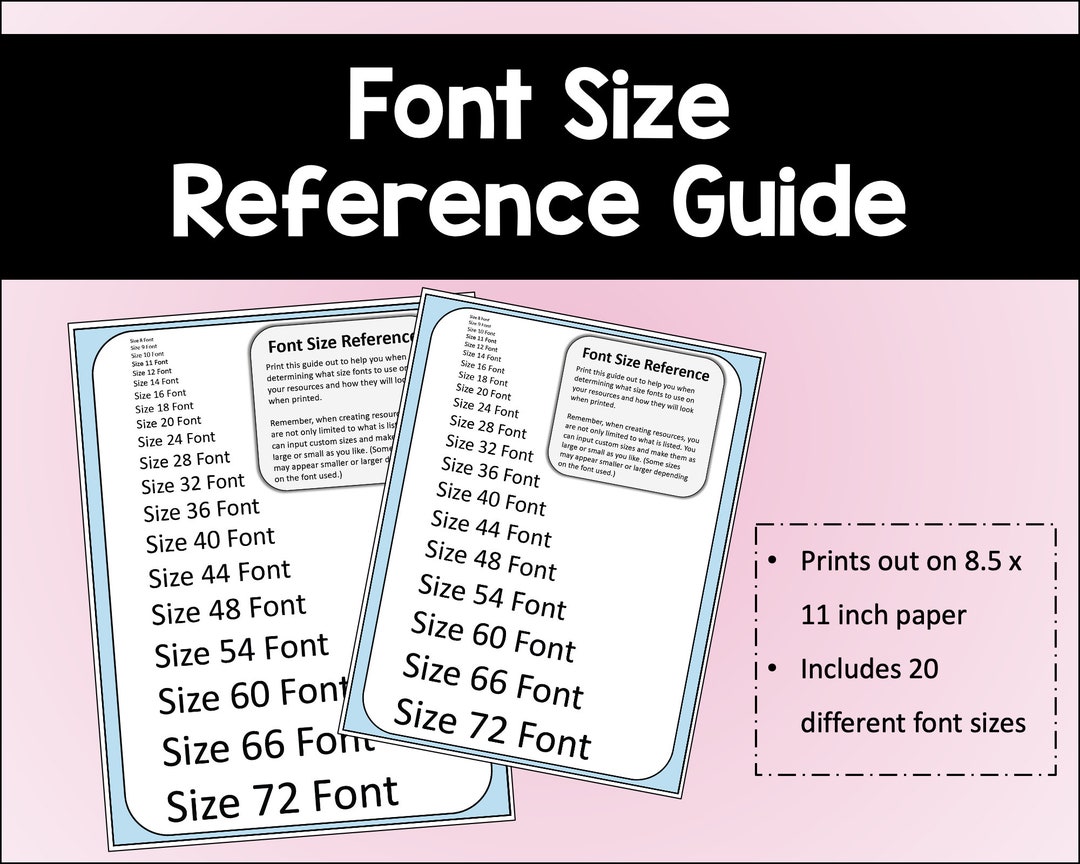
Font Sizing Guide

Hey there, friend! Let's talk about something that's really important, but often overlooked: font sizing! I know, I know, it sounds like a snooze-fest, but trust me, it's cruc...
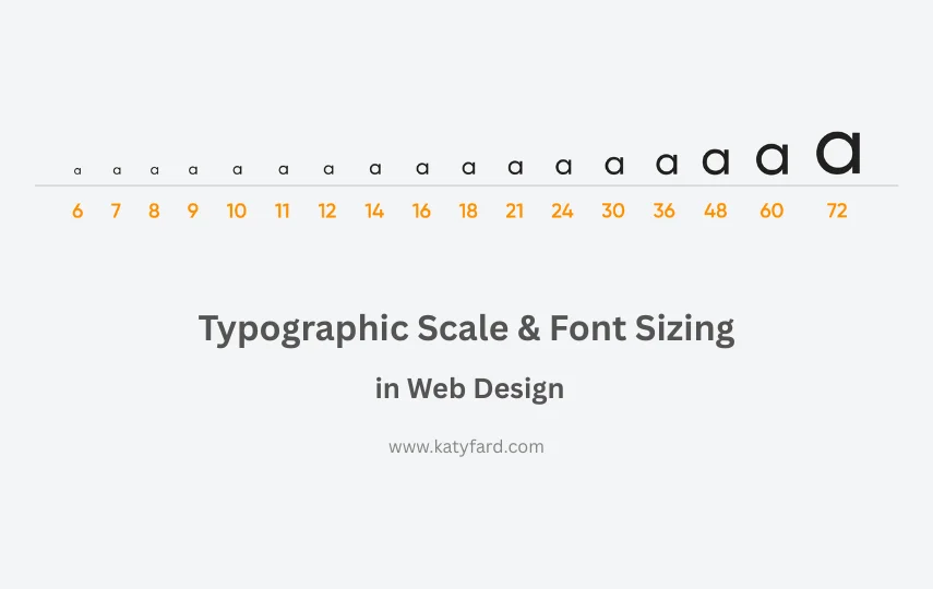
Hey there, friend! Let's talk about something that's really important, but often overlooked: font sizing! I know, I know, it sounds like a snooze-fest, but trust me, it's crucial for making your content look amazing. Think about it, when was the last time you read something with teeny-tiny font? Yeah, it was probably a chore, right?
So, here's the deal. When it comes to font sizing, there are a few things to keep in mind. First, you want to make sure your font is legible. That means it should be big enough to read without straining your eyes. A good rule of thumb is to use a font size that's at least 16 pixels for body text. Anything smaller than that, and you're entering font danger zone!
But, font sizing isn't just about being able to read the text. It's also about creating a visual hierarchy. You want to use different font sizes to draw attention to important information, like headings and subheadings. This will help your readers navigate your content and understand what's really important.
Must Read
So, the next time you're working on a project, remember: font sizing is key! Don't be afraid to experiment with different sizes and styles until you find the perfect combination. And hey, if all else fails, just remember that bigger is often better when it comes to font sizing. Happy designing, and don't forget to have fun with it!
In conclusion, font sizing might seem like a small thing, but it can make a huge difference in the way your content looks and feels. So, go ahead, get creative, and find the perfect font size for your next project. Your readers (and their eyes) will thank you!